Almell – Logotype & Identity
Almell is a company dedicated to sustainable construction and creative reuse, often known as cradle to cradle. By implementing the top two steps of Lansink's ladder – reduce and reuse – they offer services to increase circular flows in the construction industry.
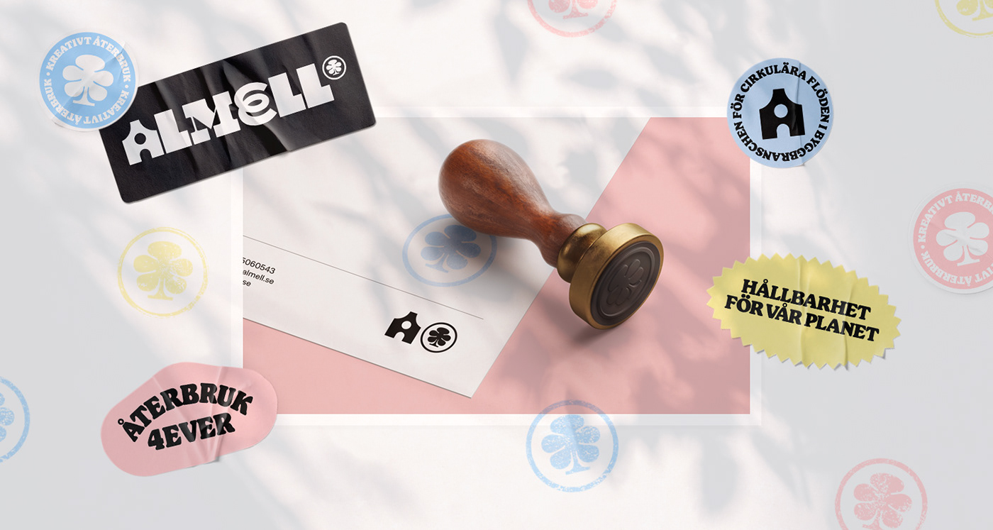
As they embrace both tradition and modernity, this is reflected in the logo where diverse letterforms unite; merging old and new typographic styles to mirror Almell’s commitment to innovation and creative reuse – all while paying homage to the cultural heritage of architecture. Furthermore, the name itself is a fusion of two surnames, Almer and Lysell, originating from Almell’s founder Erik Johansson's family history.
The initial letter 'A' serves as Almell’s symbol for progress. It's a representation of a house under construction. Sometimes, it stands tall and complete, symbolizing their achievements. Other times, it resembles a ruin, ready for restoration, highlighting their dedication to renewal and transformation.
Accompanying the wordmark is a symbol of an elm tree. The Swedish word for elm is “alm” and this tree is deeply intertwined with Almell's history as it once stood on the plot belonging to Erik Johansson's grandparents, in Grebbestad, Sweden. Today, it serves as the company's headquarters.